How to Nail Data Visualization in 2022

Statista and other statistics websites’ growing popularity tells us that putting your data into a visualized or graphical style gives it much more meaning and significance. Straight statistics are dull and monotonous, but the visual depiction of data makes it interesting to read. The latest BI tools help you create graphics to uncover links between variables and understand their relevance in a broader picture. This blog will guide you on how to nail data visualization and graphical representation in 2022.
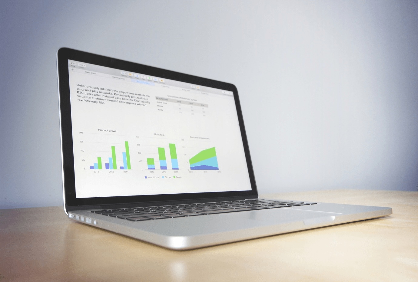
What is Data Visualization?
Data visualization is essentially a graphical representation of data in the form of charts, maps, graphs, etc. The purpose of data visualization is to make random data interpretable. There are several BI tools like Tableau and Power BI to analyze data and sense patterns and trends. Data visualization helps businesses see the big picture, get an insight into the market dynamics, and convey business metrics.
Achieving Success in Data Visualization
With effective data visualization, you can make it easier for your audience to comprehend massive data sets. Follow these guidelines to design and share complex data sets with any type of audience:
Analyze Your Target Audience
Determining your target audience is the first thing to consider when creating data visualizations. Determine the type of people requiring this data, why they need it, and the possible challenges your audience may face. The type of dashboard you create must serve the interest of your target users.
The Right Visuals for the Right Data Type
One of the biggest mistakes most designers make is choosing the wrong visual for a data set. While you can easily plot variables and data on any type of visual, the interpretation of data for each visual cannot be the same. We have various chart types to plot data, including bar charts, line charts, bullet charts, pie charts, mapping, etc. Use the right visual for the right type of data and required interpretation.
Use Color Variations to Highlight Data
When you’re working with multiple variables in a complex correlation, it’s important to assign distinctive colors to each type or group of data. Using multiple colors helps you sift your information in a meaningful pattern and highlight certain data trends. Using the same color or various shades of the same color confuses and makes it difficult to interpret.
Leverage White Label Web Design for Professional Data Visualization
Data collection and visualization is a complex procedure that is better left to professionals. At IG Webs, our design and development experts ensure your data is represented with precision and perfection. Our ultimate web designs, seamless web development, and search engine optimization best practices make us one of the best e-commerce web development companies in Huntsville.
Get a free quote today for custom web design services. Let’s connect!
IG Webs – Web Design, SEO Content Services, Website Management & More! Give Us a Call for A Free Quote Today!
We provide responsive websites, mobile websites and website management from start-ups to medium large businesses across the nation. At IG Webs, success means a website that presents the client’s business and ideas in an interesting and effective manner. Website Design, Local Marketing, SEO Content Services, Website Management, E-Commerce and more! Call us today or use our free quote form – Allow us to quote you a price and get started on your project. You’ll be glad you did!
“Your Online Business Success is Our Success!“
BBB
![]()

2021 Award

You May Also Like …

Signs Your Website is Driving Customers Away Instead of Building Loyalty
A website that loads too slowly causes visitors to leave before they even see what you offer. In 2025, users expect pages to load in under three seconds. Above all, they want speed and hassle-free...

Essential SEO Tips for Boosting Your Website’s Visibility
If you want to improve your website, you can’t just hope things work out for the best. You need to put in the effort and the right strategies to succeed! So, let’s go over some essential SEO tips...

Website Design Trends: What’s Hot and What’s Not in Modern Web Design
Think of a store with lights that go on and off, untidy shelves, and an unorganized setting. You wouldn’t stay long there, right? You might not even go inside the store if you see how messy it is...
0 Comments