A high converting landing page is often within reach. Most marketers don’t get to it because they forget the essentials of conversion rate optimization.
Here we will go through four simple steps that can turn your lacklustre page into an overnight star.
Provide Social Proof
Social proof can go a long way in adding credibility to your site and improve conversions.
Social proof can be of two types— real time and static.
Static
Social media icons that show high social share counts are proof of the page’s trustworthiness.
Real Time
The second kind of social proof is real time. Specifically, real time updates on the number of downloads or sales of the product on the page.
This feature is something I’ve seen in a lot of eCommerce sites lately and might work for you too because it acts as proof that people are buying from the site regularly.
However, adding any extra element on the salespage comes with a strong caveat.
Adding anything that takes away focus from the main goal — filling a form, clicking through to a call to action, purchasing something and should be made permanent.
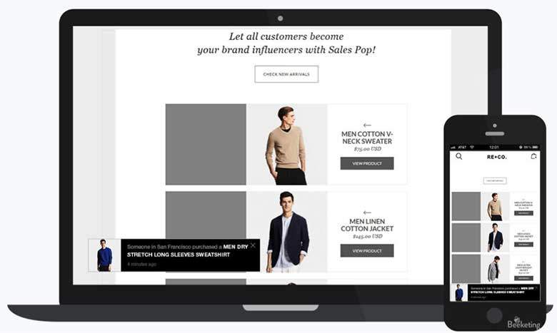
On WordPress the plugin that can show real time sales notifications is called WooCommerce Live Sales Notifications plugin.
Optimize the call to Action button
Your Call to Action (CTA) is the final step that acts as bridge between the visitors and the desired action on a landing page. As such the CTA should be prominently placed. You should design it in a way that it stands out from the rest of the on-page elements. The CTA should be big, bold and eye-catching.
Instead of using dry and drab words like “Submit” use words that drive action like: “Get your ebook”, “Buy now”, “Get immediate access to course” and so on.
The words should give visitors a preview of what they’re going to get.
Also, don’t turn your button into a CSS circus adding all kinds of animations and glitter in an effort to call attention to it.
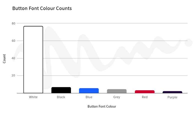
Tests run by Midas Media saw that the best converting call to action buttons sport a simple statement and simple design.
They tested 90 different buttons to arrive at the conclusion. Each time—a simple choice of colors and buttons beat the flashier versions.
The highest converting buttons used grey, blue, red and white colors while discarding brighter colors.
Limit choices on landing pages
The third strategy is to limit choices on landing pages.
Research conducted by the duo of Sheena Iyengar and Mark Lepper pitted 24 varieties of jam against 6 varieties to discover that when the number of choices increased, sales decreased.
This is how the test went:
It began with a display of 24 varieties of gourmet jam in a food mart.
Visitors to the food mart were allowed to sample the jams and in return got a coupon that saved them a dollar should they decide to make a purchase.
It was seen that the larger varieties of jams resulted in more number of people coming to watch the display. There was another much smaller stall as well— with 6 varieties of jam. Comparing and contrasting the sales generated from each stall, it was surmised that among those who viewed the bigger display only 10% were likely to make a purchase.
In a world that can’t seem to get enough choices it may seem crazy to propose that too many choices are counter-intuitive when it comes to inspiring others to make a decision to zero down to one choice.
But that’s the truth.
Here’s why this happens:
Choice seems good in that it allows us to see different options and select one that fits us most. But choice has a latent downside in that it’s inversely proportional relationship to actual decisions.
It’s due to the complexity of human mind and the fact that we value losses more than we value gains. Each option lessens our sense of well-being when making a choice as we reject all others and choose one and one alone. As the number of choices increases the feeling of well-being diminishes.
This leads to anxiety, regret and self-blame and instead we resort to not making a single choice— effectively avoiding regret.
eCommerce sites have a habit of overdoing the number of possible sane choices.
Some cases warrant more number of choices. But, in most cases you don’t need to provide more than the bare minimum.
If you’re searching HP computers, a site that throws up all the computers they have in their inventory doesn’t provide you a viable solution.
In fact, you may leave because of the abundance of choices.
Decision making goes for a spin in such cases and the result is that the user can’t make any decision due to choice paralysis.
Here’s an example.
On Branders.com when I searched for pen I got a search result page that showcased 672 products in total with the default option showing 60 products per page.
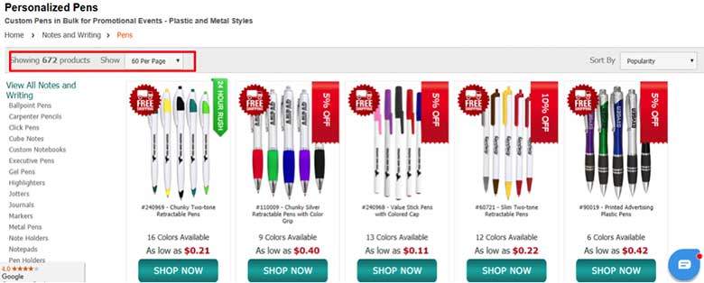
It’s difficult to make one choice in this dizzying array of options—especially when there are no review stars guiding me.
Let’s consider one more example.
I landed on Samsung’s site when searching for their latest model- the A6. On the landing page, predominantly I find two choices—either A6 or A6+. I can either book a demo or purchase the model.
They have done a good job a limiting the number of choices but could have done better in limiting the choice to a single model.
The tabs you see down below are javascript buttons and don’t lead you to a new page but only another sub-heading within the page.

Leverage Urgency
Scarcity is a potent motivator. People don’t like missing out on things and if there’s a sale chances are the traffic and sales would burgeon. Same reason why Black Friday and Cyber Monday attract so much traffic and put a significant spike on sales.
Statements that display this urgency front and centre can lead to an uptick in sales. For instance, a simple sentence that sales for a particular product ends in x time with a countdown timer next to it can result in double the revenue from the product than otherwise.
But how do you properly leverage urgency?
By understanding how it works.
There are two kinds of urgency: real and implied. We’ll see examples of both.
Real urgency— a 332% increase in sales
In this example, we will see how Marcus Taylor leveraged urgency to improve conversion rates for his “bundle package for musicians” from mere 2.5% to 10.8%
Marcus attributes scarcity and urgency to be the biggest contributing factors in sales.
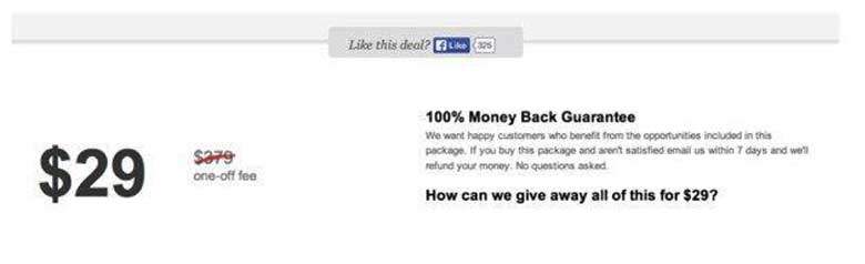
Here’s the control. The control is sans any element that displays urgency. There’s assurance of 100% money back guarantee and the fact that there’s a big sale going on.
Variation A:
Variation B:
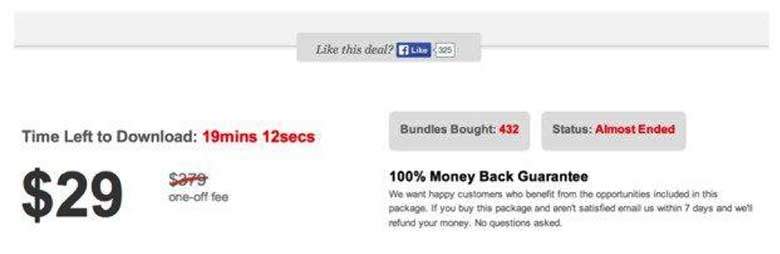
The second version displays urgency front and center and re-affirms the status of the sale adding strength to urgency. One— the landing page displays a countdown timer and two— it displays a status that the sale is almost ended. At the same time the sales page leverages social proof by displaying how many bundles were bought.
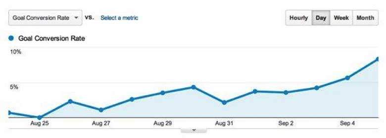
The conversion rate tripled with variant B.
In the graph below you can see when the version B was gradually rolled out to the entire traffic and subsequent steady increase in conversions.
Real urgency is using countdown timers and setting an end date for the offer. Once the time limit expires the offer won’t be available any longer. Implied urgency is subtle. It’s in using words like now and today in the copy to drive action. And despite what you believe in implied urgency too works.
Implied Urgency
Here’s an example.
Here are 5 headlines that were a/b tested against each other with a free wordpress plugin.
The result wasn’t one off but was repeated across several headlines.
 The title one which is the control headline without any urgency be it either implied or real generated a CTR(Click through rate) of 0.77%.
The third headline with the word today had a click through rate of 3.94%. Perhaps the second headline didn’t work because reducing bounce rate isn’t an urgent problem that needs an immediate solution.
Conclusion
That brings us to the conclusion of the post and the simple steps that can lead to doubling or tripling conversions from existing traffic.>
However, adding urgency and scarcity, reducing the number of available options, having a contrasting button colour and so on doesn’t mean anything if your page is full of distracting elements that don’t contribute to the conversion goal.
An irrelevant offer or a not so useful offer too won’t get many conversions. First strengthen the foundation and then start building on it. All the elements I discussed in the post are strong catalysts that on the right page boost conversions manifold.
The right page should have the right offer, the right kind of traffic and a clean design.
What do you think? Do let us know in the comments below.
Author bio: George is a versatile tech blogger who’s been in the industry since the past 8 years. Read his newest article today.
IG Webs – Web Design, SEO Content Services, Website Management & More! Give Us a Call for A Free Quote Today!
We provide responsive websites, mobile websites and website management from start-ups to medium large businesses across the nation. At IG Webs, success means a website that presents the client’s business and ideas in an interesting and effective manner. Website Design, Local Marketing, SEO Content Services, Website Management, E-Commerce and more! Call us today or use our free quote form – Allow us to quote you a price and get started on your project. You’ll be glad you did!

