How to Create Highly-Converting Ecommerce Product Pages
As e-commerce continues to thrive, competition is getting heated as well. No longer do simple, Amazon-like product pages cut it. Customers want to be awed by your copy and your visuals, as well as the layout and design of your pages. But above all, they want to have a pleasant shopping experience.
Let’s take a look at seven principles to use in product page design that can directly impact your conversions.
Use High-Quality Images
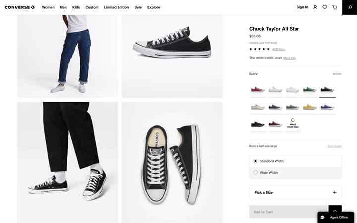
First, you have to show the product, and you have to show it in the best possible light. High-resolution images shot from different angles and a product-in-action image will all help your potential customers visualize the item in 3D.
If you also throw in a video of that product in action, the value of the page will increase even more. Granted, it may be challenging to shoot and produce clips for every product. So, if you don’t have the resources for both, focus on the images first.
Converse, for example, shows their sneakers from every angle imaginable. They show them on a model with socks and on a model without socks. There’s not much left to be desired, and it’s very easy to note even the minute details.
Provide Social Proof with Reviews and Trust Badges
Before making a purchase, customers love to see what people who have already tried their item think about it. This is why reviews on the product page are so important. They allow potential shoppers to base their purchasing decision on more than just your sales copy.
Trust badges (for example, detailing the payment methods you accept) are another way to add credibility to your page. Use them to highlight the fact that your store is safe, secure, and trustworthy.
Like many other stores, Matalan has a separate Reviews tab on their pages. That way, users won’t be bombarded with reviews, but they’re free to check them out at their own leisure.
Communicate the Value Proposition in the Description
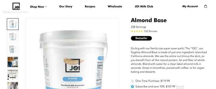
Customers essentially just want to know what a product will do for them. They don’t care about all those clever features just for the sake of cleverness. They want to know the specific benefits of those features and how they will solve a problem they’re facing or improve their lives.
When composing your product descriptions, always write about the customer and what they can expect to get, as opposed to merely describing the product.
JOI has nailed this type of product description. They do tell you what the product is, but they also highlight its benefits for the customer. On top of that, they have a “Why It’s Special” section that goes into extra detail.
source: addjoi.com
Use Icons and Images to Communicate Selling Points
Sometimes, you don’t need to use words to talk about the product, and you can achieve a much better effect by using an icon or an image. And that’s especially if you are relying on familiar icons. For instance, that would be denoting the packaging of a product is recyclable, that it’s Vegan or cruelty-free, etc.
You can also design your own imagery and creative icons that will catch the customer’s eye and help them get the gist of a product at a glance.
Herbal Dynamics Beauty has four icons on their product pages that highlight their key selling points. Although they are not universally used, they communicate the point in a nutshell without the need to go into added descriptions.
![]()
source: herbaldynamicsbeauty.com
Use an Inverse Pyramid Approach to Value
To best showcase the value of a product, lead with the main information at the top of the page, and slowly work your way downwards with any additional information a visitor may find useful.
Above the fold, place all the key details, such as:
- what the product is
- what it’s made of
- the price
- who it’s made for, etc.
After that, make any FAQs, How it works, and similar sections reachable with a scroll or two.
West Elm has product pages built along these lines, with their product imagery at the top and additional details further down the page.
Minimize Distractions
One of the basic principles of modern product page design is minimalism. The fewer distractions available, the easier it will be for the visitor to focus on the features of the product.
Uniformity is essential. You want all the pages to be the same but varied only in imagery and copy.
The CTA is the one element you do want to draw attention to. And the best way to draw visitors’ eyes to that CTA is by keeping the rest of the page minimal. Whether you use a contrasting color or a vibrant button design, the goal is to make it quite clear how a customer can convert.
The Company Store has kept their product pages very minimal, and yet you won’t fail to notice the CTA. Although it stands out, it doesn’t take up too much of your attention. Overall, it manages to both blend in and pop at the same time.
source: thecompanystore.com
Final Thoughts
By implementing some of these design principles into your product pages, you’ll be able to ease the path to conversion. With enough patience and dedication, you’ll show your customers why making that purchase is a decision that benefits them.
IG Webs – Web Design, SEO Content Services, Website Management & More! Give Us a Call for A Free Quote Today!
We provide responsive websites, mobile websites and website management from start-ups to medium large businesses across the nation. At IG Webs, success means a website that presents the client’s business and ideas in an interesting and effective manner. Website Design, Local Marketing, SEO Content Services, Website Management, E-Commerce and more! Call us today or use our free quote form – Allow us to quote you a price and get started on your project. You’ll be glad you did!

